Streamlining game-day sign-up for a college-sports membership
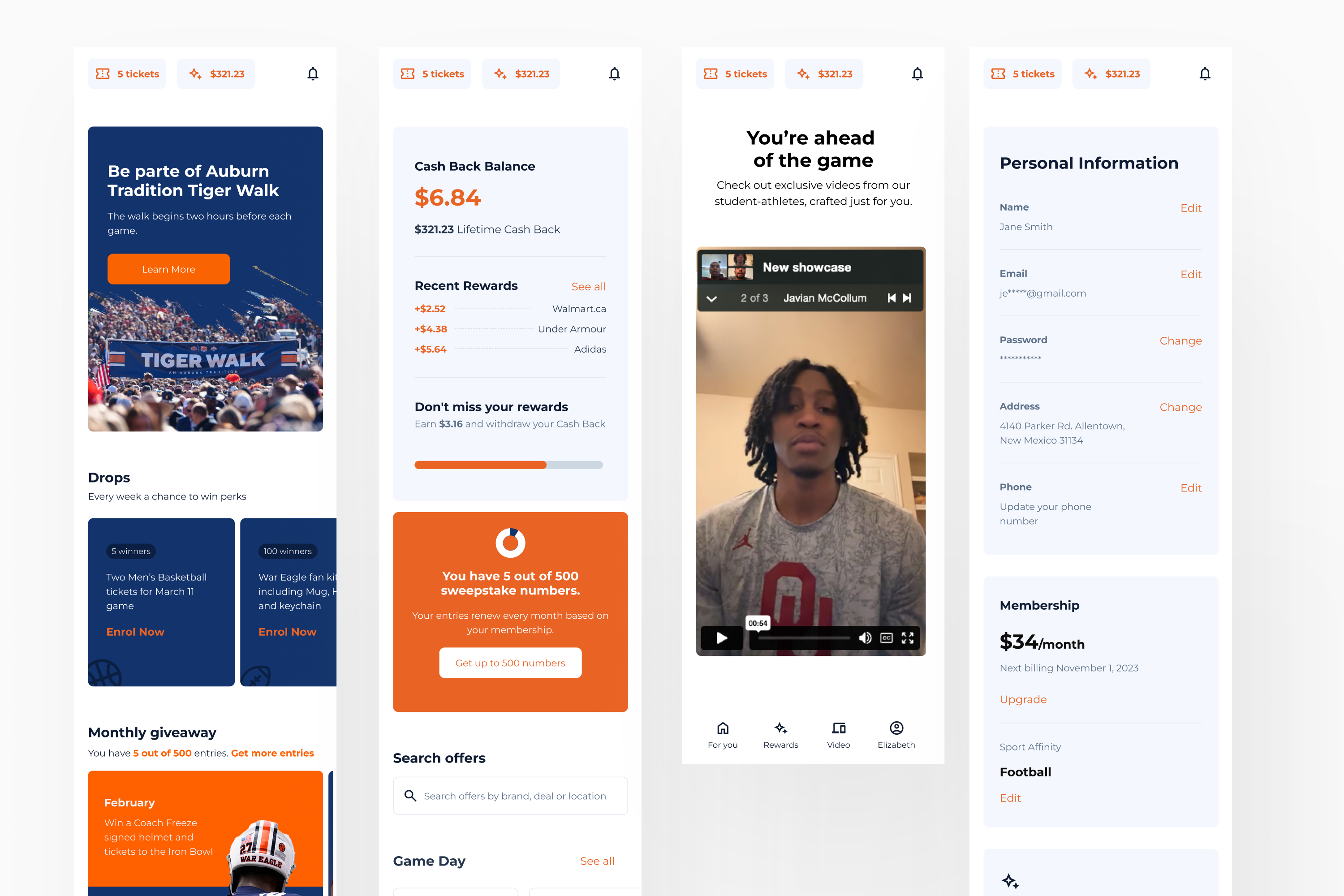
ChangeIt is a membership platform built for college sports. The product pivoted from a charity round-up app into a membership engine for college sports, and sign-ups moved to live activation stands on game day. Here's how we made it fast enough for that setting.
The product pivot meant a significant part of activation now happened on-site, on game day. The existing flow took around six minutes to complete, and every extra step increased the chance of losing someone before activation. Combining on-site observation with Amplitude funnel analysis to understand user behaviour we reduce the completion time around 6 minutes to 3 minutes. Payment-screen drop-off improved from 76% to 62%.
Context
We're creating a product to validate a new business model for the company that operates in the 50/50 raffles for non-profit market. A team was created to work in a fast and uncertain environment, where all opportunities should be taken into consideration. So we tried different markets and pivoted from a charity round-up app into a membership engine for college sports, and sign-ups moved into a completely different environment: live, game-day activation stands. This is how we diagnosed the friction and redesigned the activation flow to make it fast enough for the context.
The product had changed, the context had changed, but the sign-up flow had not caught up.
The challenge
The original activation flow worked, people were signing up, but we noticed room for improvement in some parts of the flow.
This new scenario, feedback matters, and a blank loading state could cost the sign-up. Also, people want to enjoy the event, so avoiding unnecessary steps is crucial too. “How do we make this flow realistic for someone signing up on their phone, in public, while standing in line?”
Aproach
1. Email sign-up at the top
The first design direction gave more priority to social login. But the data showed that users were choosing email sign-up more often. 55% of users chose email sign-up. The sign-up page also had a 33% bounce rate. There was room to improve the page, but compared with the rest of the funnel, this was not where the biggest friction was happening.
What was done: We made email and password visible on the first screen, treated email as the primary sign-up path, and removed the extra “account info” step that made account creation feel slower than it needed to be.
2. Tier selection created hesitation
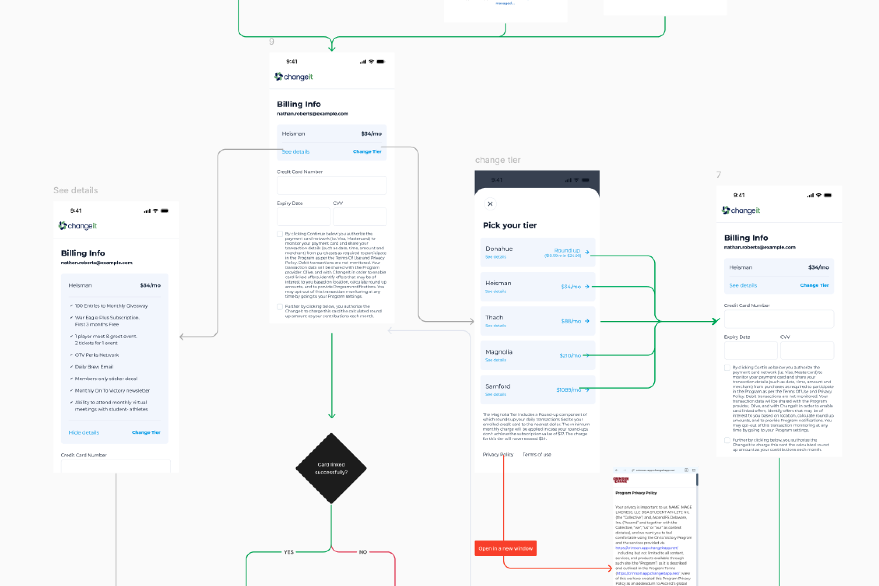
The tiers page was the biggest pre-payment friction point. 57% of the users dropped off before reaching the billing info page. That was a strong signal. We were asking people to create an account first, then asking them to choose a membership tier. That meant users were committing to the sign-up process before they fully understood the offer and the pricing.
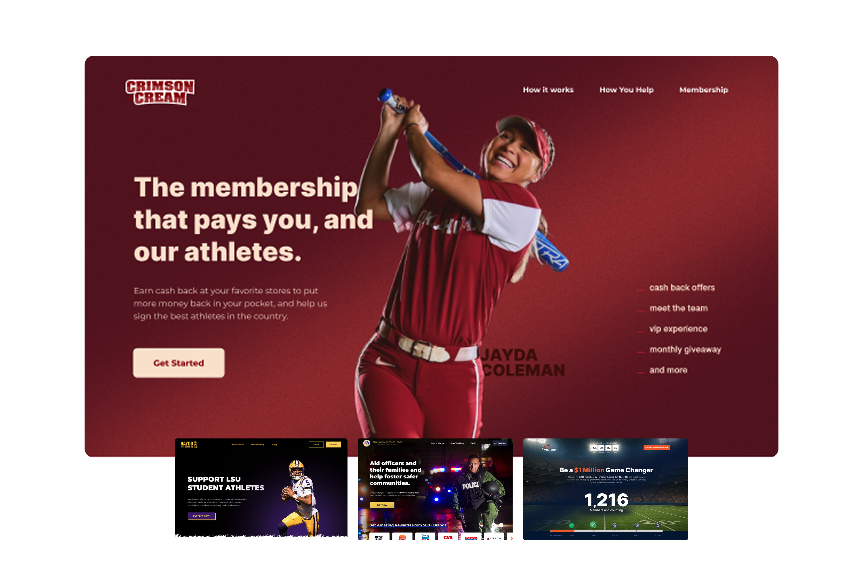
What was done: We moved tier selection before account creation, made the tier cards easier to scan, and added a clearer select button. We did not always control every customer landing page, so the flow needed a fallback for cases where a tier could not be passed cleanly into sign-up. The solution had to support the ideal path without breaking the less controlled paths.
3. Payment needed more clarity and recovery
Payment was the final step before activation, but it had two important issues. First, only 24% of users converted from the payment page to membership activated. Second, 25% of users went from the payment page back to the tiers page. The payment step also included a third-party payment iframe. Sometimes that iframe loaded as a blank space before appearing, which made the flow feel broken even when it was technically working. Users who did convert from payment to member took a median of 2 minutes and 46 seconds.
What was done: We added a clear loading state for the payment iframe, kept tier details visible inside billing, and made it possible to change tiers without losing progress. The goal was to reduce uncertainty without forcing people to restart.
Conclusion
The redesigned flow reduced the average completion time from around 6 minutes to 3 minutes. That was the most important outcome for the activation context. Cutting the time in half made the flow much more realistic for a live event environment. The payment step also improved. Payment-screen drop-off improving from 76% to 62%. It was not a big redesign, small, data-informed adjustments backed by metrics and research allowed us to improve the user experience and reduce onboarding friction.
This project involves many more tests and hypothesis validation. Reach out to me to hear more.